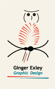
Less-is-More Logos
This was an "exploration" project in which we really didn't have an end product in mind. We had to start with an image of some object, plant, or animal; convert it to black and white; crop it once; crop it again; invert the colors; add one color; and incorporate it into a logo with text. I used the same shape to create two different logos. Fun!